The choice between Giclée and C-Type is not about which is ‘better,’ but which printing method best serves your artwork’s market narrative and physical presence.
- Giclée excels in archival longevity and substrate versatility, allowing for a highly controlled tactile experience on materials like cotton rag.
- C-Type provides the classic, continuous-tone ‘photographic feel’ deeply rooted in the history of darkroom printing.
Recommendation: Base your decision on the desired ‘haptic signature’ of the final print and the story of craftsmanship you wish to convey to your collectors.
For any photographer looking to transition their work from the screen to the gallery wall, the debate between Giclée and C-Type printing is a foundational crossroad. It’s often presented as a simple technical choice: the precision of modern inkjet versus the tradition of light-sensitive paper. This perspective, however, misses the fundamental point. The decision is not merely technical; it’s a critical act of strategic creation that defines the final artwork as a physical object. It’s about consciously engineering the artifact you intend to sell.
Most discussions devolve into a list of pros and cons, but a master printer sees it differently. The real question is not « Which is superior? » but « Which process and material combination will most powerfully embody the intent of this specific photograph? ». This involves considering the artwork’s mood, the story you want to tell your collectors, and the physical sensation you want the print to evoke when held. It’s about crafting a haptic signature—the unique tactile identity of the print—that complements its visual content.
But if the real key wasn’t the technology itself, but rather how you wield it to define the print’s value, longevity, and market narrative? This guide moves beyond the surface-level debate. We will dissect each aspect of the print as an object, from its texture and colour fidelity to its handling and archival permanence. We will explore how to translate your digital vision into a physical artifact without compromise, and finally, how to position that artifact in the modern art market, even connecting it to a digital certificate of authenticity. This is your blueprint for making a strategic printing decision that elevates your photography from a simple image to a collectible work of art.
This comprehensive guide is structured to walk you through every critical decision point in producing and selling fine art prints. The following table of contents outlines the key stages we will explore, from the foundational choice of paper to the advanced considerations of the digital art market.
Contents: A Strategic Guide to Fine Art Printing
- Matte or Gloss: How Paper Texture Affects the Mood of Your Print?
- RGB to CMYK: Why Do Your Prints Look Different from Your Screen?
- Pencil or Ink: Where and How to Sign a Limited Edition Print Correctly?
- The Error of Touching the Surface: How to Transport Big Prints without Kinking
- Fade Resistance: How Many Years Will an Inkjet Print Last in Frame?
- Photoshop to Plate: How to Prepare Digital Negatives for Printmaking?
- Phygital: How to Sell a Print with an NFT Certificate Successfully?
- Is Selling Photography as NFTs Still Viable for UK Artists in the Current Market?
Matte or Gloss: How Paper Texture Affects the Mood of Your Print?
The first decision in artifact engineering is the choice of substrate. This is where the print acquires its soul. The paper’s texture, weight, and finish are not secondary characteristics; they are the primary medium through which your photograph communicates tactilely. A high-gloss C-Type print on Fuji Crystal Archive paper offers deep, rich blacks and vibrant colours with a smooth, reflective surface that speaks the language of classic commercial and gallery photography. It feels slick, modern, and punchy.
In contrast, a Giclée print on a heavy, 310gsm cotton rag paper with a matte finish absorbs light, presenting colours with a subtle, velvety depth. The physical texture of the paper itself becomes part of the viewing experience, lending an air of handcrafted permanence and artistic gravity. Professional print labs confirm that while C-type prints offer the tactile feel of traditional photographic prints, Giclée’s advantage lies in its compatibility with a vast range of tactile coated and uncoated papers, each with a distinct fine art feel.
This choice directly influences the mood. A dramatic, high-contrast black and white street photograph might sing on a glossy C-Type, its reflections enhancing the urban chaos. A soft, ethereal portrait, however, may find its perfect expression on a matte Giclée paper, where the lack of reflection invites intimate viewing and the fibrous texture complements the organic nature of the subject. The decision is not about right or wrong, but about alignment between the visual narrative and the haptic signature.
As this detailed view of a fine art paper shows, the texture is not a flaw but a feature. The subtle weave and organic fibers of a high-quality cotton paper contribute to the object’s perceived value and uniqueness. When choosing your paper, you are choosing the physical foundation of your art’s narrative.
Ultimately, your paper choice should be a deliberate one, made with samples in hand. Feel the weight, observe how light plays across the surface, and imagine which texture best serves the story your photograph tells.
RGB to CMYK: Why Do Your Prints Look Different from Your Screen?
The most common frustration for photographers entering the world of print is colour discrepancy. The vibrant image on your calibrated monitor looks flat or discoloured on the final print. This is not a failure of the printer; it is a fundamental misunderstanding of colour spaces. Your screen creates colour with light (RGB: Red, Green, Blue) in an additive process. A printer creates colour with ink (CMYK: Cyan, Magenta, Yellow, Key/Black) in a subtractive process. They are different languages.
The RGB colour space, particularly wider gamuts like Adobe RGB (1998), is significantly larger than the standard CMYK gamut. To put it in perspective, RGB can produce over 16 million colours, whereas CMYK is limited to a smaller subset. This means that highly saturated blues, greens, and reds visible on your screen may be « out of gamut » for the printer and will be automatically converted to the nearest achievable colour, often resulting in a loss of vibrancy.
The key to mastering this translation is not to fight it, but to manage it through a process called soft proofing. This digital workflow allows you to simulate, directly in Photoshop or similar software, how your RGB image will look when converted to the specific CMYK profile of the printer and paper you have chosen. It is the single most critical step in achieving predictable, high-quality prints. By soft proofing, you can see which colours will shift and make targeted adjustments *before* you ever commit ink to paper, saving time, money, and disappointment.
Action Plan: Professional Soft-Proofing Workflow
- Colour Settings: In Photoshop, go to Edit > Colour Settings and ensure you are working in an appropriate RGB space, such as Adobe RGB or ProPhoto RGB.
- Access Proof Setup: Navigate to View > Proof Setup > Custom to open the soft proofing dialogue box.
- Select ICC Profile: In ‘Device to Simulate’, choose the specific ICC profile provided by your print lab for their C-Type or Giclée process and the exact paper you are using. This is a non-negotiable step.
- Identify Problem Areas: Enable ‘Gamut Warning’ (View > Gamut Warning). Photoshop will highlight all the colours in your image that are outside the destination printer’s gamut.
- Make Targeted Adjustments: With the gamut warning active, use adjustment layers (like Hue/Saturation or Selective Color) to gently pull the out-of-gamut colours back into the reproducible range, preserving the overall feel of your image.
By taking control of the RGB-to-CMYK conversion, you elevate yourself from a photographer to a true printmaker, ensuring the final artifact is not a happy accident but a faithful execution of your artistic vision.
Pencil or Ink: Where and How to Sign a Limited Edition Print Correctly?
Signing a print transforms it from a reproduction into a unique work of art. The signature and edition number are a critical part of its provenance and value. However, the correct method is a subject of much debate, and the choice of printing process—Giclée or C-Type—directly impacts the correct tools and techniques. The convention is to sign in the bottom-right margin below the image, with the edition number (e.g., 2/25) in the bottom-left. The title, if included, typically goes in the center.
The traditional tool is a soft graphite pencil (2B or 4B). The graphite is archivally stable and gently embeds into the paper fibres without bleeding. It has a classic, understated look that signals fine art tradition. On the textured, absorbent surface of a matte Giclée print on cotton rag paper, a pencil is the perfect choice. It becomes one with the paper, reinforcing the artifact’s handcrafted quality.
Using a pen is more complex. Most inks are not archivally stable and can fade or discolour. More importantly, attempting to sign a glossy C-Type print with a standard pen is a recipe for disaster, as the ink will bead up or smudge on the non-porous surface. If you must use ink, it must be an archival pigment ink pen, and even then, it’s best reserved for matte or semi-matte surfaces. As fine art print handling standards show, the physical nature of the print is paramount.
C-Type’s inherent fragility (a delicate gelatin emulsion surface highly susceptible to fingerprints and scratches) contrasts with the surprising resilience of high-GSM cotton rag Giclée prints.
– Professional printing guidelines, Fine art print handling standards
This fragility means that for C-Type prints, especially those with a gloss finish, signing on the back of the print (in archival ink) is often the safest and most professional practice. This protects the delicate image surface from both the pressure of the pen and potential smudging. For a matte Giclée, the front signature is standard. The key is to match the tool and location to the print’s physical properties.
Always test your signing implement on a spare test strip or a corner of the print’s border that will be trimmed or matted over. Your signature is your mark of approval; ensure it enhances the artwork, rather than compromises it.
The Error of Touching the Surface: How to Transport Big Prints without Kinking
A pristine print can be ruined in seconds by improper handling. The single most important rule is to never touch the image surface. The oils and acids from your fingers can permanently mar the delicate emulsion of a C-Type or the absorbent surface of a Giclée print. This rule becomes exponentially more critical as the size of the print increases.
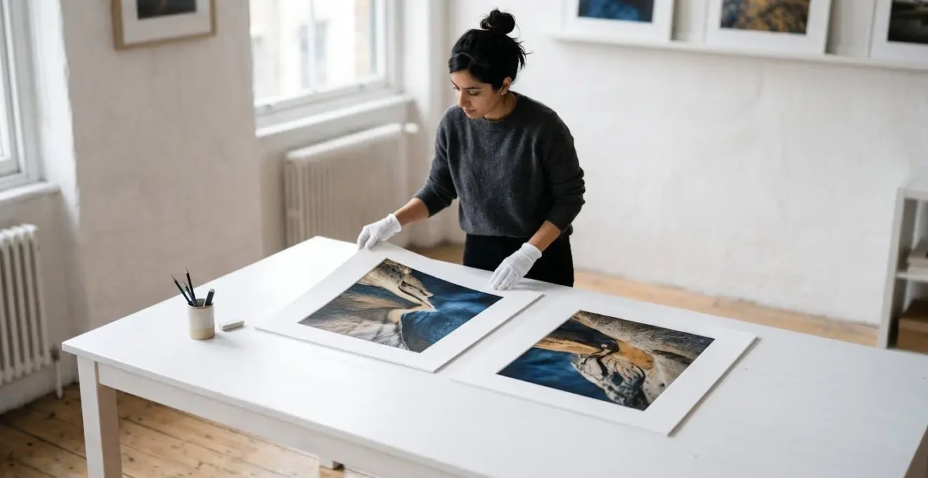
For any print intended for sale or exhibition, handling should only ever be done while wearing clean, white cotton archival gloves. These prevent fingerprints and provide a slight grip without being abrasive. The technique is to handle the print only by its extreme edges, using the palms of your hands to support the majority of the weight from underneath, rather than pinching the edges with your fingertips, which can cause dents.
When transporting large prints, the primary enemies are kinks, creases, and corner damage. A print laid flat in the back of a car is a magnet for disaster. The best practice for unmounted prints is gentle rolling. Lay the print image-side up on a clean sheet of acid-free glassine paper, which protects the surface. Place another sheet of glassine on top. Then, gently roll the print and glassine together around a wide-diameter tube (at least 4-6 inches). Never roll a large print tightly, as this can cause the ink or emulsion to crack. Secure the rolled print with a paper band; never use rubber bands or tape that could contact the print.
For maximum protection, this rolled print should then be placed inside a sturdy cardboard shipping tube. If transporting prints flat, they must be encased in a professional portfolio or between multiple layers of rigid, acid-free board, and securely taped to prevent any shifting during transit. The investment in proper materials is negligible compared to the cost of reprinting a damaged one-of-a-kind piece.
Treat every print as the final, irreplaceable artifact it is. This discipline not only protects your financial investment but also demonstrates a level of professionalism that collectors will notice and respect.
Fade Resistance: How Many Years Will an Inkjet Print Last in Frame?
For a collector, purchasing a fine art photograph is an investment. A key component of that investment’s value is its permanence. A print that fades within a decade is not a fine art object; it’s a temporary decoration. This is where the technical specifications of Giclée printing demonstrate a decisive advantage in building collector confidence.
The longevity of a print is determined by the stability of the inks and the archival quality of the paper. Modern Giclée prints use pigment-based inks, not the dye-based inks found in consumer desktop printers. Pigments are microscopic particles of solid colour suspended in a liquid carrier. Dyes are water-soluble. This distinction is crucial: pigments are far more resistant to fading from UV light, humidity, and atmospheric pollutants. Independent testing by firms like Wilhelm Imaging Research (WIR) is the industry standard for longevity ratings. Their accelerated testing methods project how long a print will last under typical display conditions (framed under glass).
The results are definitive. High-quality pigment-based inkjet prints demonstrate over 100 years of projected display longevity without noticeable fading. When these archival inks are paired with an equally archival paper, the ratings can be even higher. A substrate like Hahnemühle Photo Rag is rated for permanence exceeding 200 years when combined with pigment inks. This is a powerful selling point. You are not just selling a beautiful image; you are selling an heirloom.
Traditional C-Type prints, while having improved significantly, generally have lower WIR ratings, typically in the range of 40-60 years for display life. While this is still excellent, it doesn’t match the multi-generational permanence offered by the best Giclée combinations. This concept of perceived permanence is vital. Being able to state, with third-party data to back it up, that your artwork is rated to last for centuries provides a level of assurance that serious collectors demand.
Therefore, when engineering your artifact for the fine art market, choosing a Giclée process with documented archival inks and papers is a strategic decision to maximize its long-term investment potential.
Photoshop to Plate: How to Prepare Digital Negatives for Printmaking?
While the direct-to-paper methods of Giclée and C-Type dominate the market, a growing niche of artists seeks to blend digital precision with the unique aesthetics of historical photographic processes like platinum/palladium, cyanotype, or photogravure. This is achieved by creating a digital negative—a process that bridges the 21st-century digital darkroom with 19th-century chemical printing. This is the ultimate expression of artifact engineering, where a digital file is meticulously prepared to become a physical tool for a hands-on process.
In essence, a digital negative is a high-resolution black and white image printed onto a transparent film. This film is then used just like a traditional film negative: it is placed in contact with a chemically sensitised paper and exposed to UV light. The challenge lies in creating a negative that will produce a perfect positive print. This requires a deep understanding of tonal curves and how they relate to the specific alternative process being used. Each process has a unique response to light and density.
The workflow begins in Photoshop. The first step is to convert the colour image to black and white, optimising the tonal range for the final print’s intended look. The critical stage is the application of a custom correction curve. This curve, often developed through extensive trial and error, adjusts the image’s tonality to compensate for the characteristics of the printing process. For example, a platinum print has a very long, smooth tonal scale, so the curve must be designed to map the image’s tones onto that scale precisely. The image is then inverted to become a negative before being printed on the transparency film.
While not a direct part of the digital negative workflow, the principle of pre-visualisation through soft-proofing is philosophically aligned. It’s about using digital tools to predict and control a physical outcome. This discipline of meticulous digital preparation is the common thread that runs through all high-end printmaking, whether the output is a Giclée print or a tool for a historical process.
Creating digital negatives is not for the faint of heart, but for those who pursue it, it offers a way to produce truly unique photographic objects that possess a digital soul and an analog heart.
Phygital: How to Sell a Print with an NFT Certificate Successfully?
In the contemporary art market, the concept of provenance—the documented history and ownership of a piece—is paramount. For physical prints, this has traditionally been managed through paper certificates of authenticity. However, the rise of blockchain technology offers a more robust, transparent, and modern solution: the Non-Fungible Token (NFT). Linking a physical print to an NFT creates a « phygital » asset, an object with both a tangible presence and a permanent, verifiable digital identity.
Successfully selling a print with an NFT certificate is not about simply « minting a JPEG. » It’s about using the NFT to enhance the value and story of the physical artifact. The NFT acts as an unforgeable, publicly verifiable certificate of authenticity. It can immutably record the artist’s name, the print’s title, the edition number, the date of creation, and a full ownership history that updates with every future sale. This creates a secure chain of custody that is far superior to a simple piece of paper which can be lost or forged.
The strategy lies in making the NFT an integral part of the artwork package. It should not be an optional extra but the definitive record of the piece. One successful model involves embedding a « digital twin » of the photograph within the NFT, and potentially including unlockable content for the owner, such as a high-resolution file, a video of the printing process, or a personal note from the artist. This adds layers of value beyond simple certification.
Case Study: Institutional Phygital Strategies
Major photographic archives have validated the phygital model. As detailed in market analyses, institutional players like Getty Images and AFP have entered the NFT space, not to replace prints, but to augment them. AFP’s model is particularly instructive: they offer limited editions of historic photographs as NFTs, with the owner also receiving a museum-quality physical print. Demand is driven by a selection process where collectors vote on which photos get minted, creating exclusivity and community engagement. This demonstrates how a successful phygital strategy uses the NFT to build a narrative and certify the authenticity of the tangible art object.
By framing the NFT as the ultimate certificate of authenticity, you provide collectors with the security and transparency they expect in the modern art market, making your physical print a more attractive and future-proof investment.
Key Takeaways
- The choice between Giclée and C-Type is a strategic decision that defines the final art object’s value and market narrative.
- Giclée printing offers superior archival longevity (100-200+ years) and unparalleled versatility in paper choice, enabling a controlled ‘haptic signature’.
- Mastering a soft-proofing workflow is non-negotiable for achieving accurate and predictable colour when translating from screen (RGB) to print (CMYK).
Is Selling Photography as NFTs Still Viable for UK Artists in the Current Market?
Yes, selling photography as NFTs remains a viable and strategic pathway for UK artists, provided the approach is professional and tailored to the current market’s maturity. The initial hype-driven frenzy of the NFT boom has subsided, giving way to a more discerning market that prioritises quality, narrative, and utility. For photographers, this is an advantage, as it shifts the focus from speculative digital assets to genuine art collecting.
The United Kingdom holds a uniquely strong position within the European digital art space. Research shows that the UK dominated the European NFT art market in 2025, capturing 20.9% of the regional share. This dominance is not accidental. It is built upon a foundation of institutional acceptance and a vibrant creative ecosystem. London, in particular, has become a global hub for Web3 and digital art, hosting major events like NFT.London that attract serious international collectors and creators.
The viability for UK artists is further bolstered by the « phygital » model discussed previously. Pioneering projects by established British artists have paved the way, legitimising the medium for traditional collectors. When an artist like Damien Hirst launches a large-scale NFT project, it has a powerful trickle-down effect, educating the market and building trust in the technology. This creates a fertile ground for photographers who can offer a tangible, museum-quality print alongside a blockchain-verified certificate of authenticity. The NFT is no longer just a token; it’s the ultimate provenance for a physical work of art, and the UK’s clear regulatory environment provides a stable framework for these transactions.
The market is no longer about quick flips; it’s about building a collector base. UK photographers can leverage the country’s strong reputation in the arts and its robust digital infrastructure to offer premium, well-structured phygital assets that appeal to a new generation of collectors who are both digitally native and appreciative of tangible craft.
To succeed, focus on the art first. Create an exceptional physical object using the best printing and paper choices, and then use the NFT as the technologically superior tool to certify its uniqueness and value in the global market.