Contrary to popular belief, hidden symbols in art are not a simple dictionary of meanings; they are a calculated code revealing an artist’s secret agenda.
- Artists used objects as visual evidence to critique society, like Hogarth’s attack on the gin crisis.
- Props were also a deliberate ploy to elevate an artist’s social status, turning craftsmen into intellectuals.
Recommendation: To uncover the real story, look beyond ‘what’ a symbol is and start asking ‘why’ the artist placed it there.
You stand before a centuries-old painting, captivated by its beauty. Yet, a nagging feeling persists—a sense that there’s more than meets the eye. You notice an odd object in the corner, a curious gesture, a flower that seems too specific to be a mere decoration. This is the thrill of art detection, the feeling that you are on the verge of cracking a code left behind by a master. For too long, we have treated these symbols as simple vocabulary words in a forgotten language: a skull means death, a dog means loyalty, a lily means purity. This approach, while useful, misses the most exhilarating part of the story.
What if these symbols were not just passive labels but active pieces of evidence? What if every object was placed with a deliberate motive, a hidden agenda? This is the secret world of British art. Artists were not just creating beautiful images; they were master strategists, using a visual language of props and allusions to comment on politics, climb the social ladder, protest injustice, and embed their personal beliefs in plain sight. They were playing a high-stakes game with their patrons and public, and the paintings are their surviving testimony. The real key isn’t just to know what a symbol means, but to ask what the artist was *doing* with it.
In this investigation, we will move beyond the dictionary of symbols and step into the mind of the artist. We will analyze the clues, interrogate the evidence, and uncover the secret motives encoded within some of Britain’s most iconic artworks. By the end, you will no longer just see a painting; you will see a carefully constructed narrative, a puzzle waiting to be solved. You will have learned to think like an art detective.
To guide our investigation, we will examine several key cases, each revealing a different facet of the artist’s secret agenda. The following summary outlines the mysteries we are about to unravel.
Summary: Uncovering the Hidden Agendas in British Art
- The Ambassadors: Why Is There a Distorted Skull at the Bottom?
- Ophelia’s Bouquet: What Do the Flowers Mean in Millais’ Painting?
- Gin Lane: What Social Ills Was Hogarth Really Attacking?
- Fidelity or Lust: What Does a Dog Represent in Victorian Portraits?
- The Slave Ship: How Did Turner Hide Anti-Slavery Messages in a Seascape?
- Mirror or Mask: What Do Props Reveal in Famous British Self-Portraits?
- Gold and Green Underpainting: Why Did Icons Look That Way?
- Byzantine vs Renaissance: How Did Tempera Techniques Evolve in History?
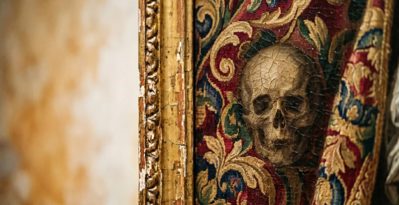
The Ambassadors: Why Is There a Distorted Skull at the Bottom?
At first glance, Hans Holbein the Younger’s *The Ambassadors* (1533) is a powerful portrait of wealth, knowledge, and influence. Two confident men are surrounded by objects of science and the arts—a celestial globe, a sundial, musical instruments. It’s a celebration of the Renaissance man. But then, your eye catches it: a strange, smeared shape hovering at the bottom. It feels like a glitch in the canvas. To decode this mystery, you must physically move, shifting your perspective to the side of the painting. From this oblique angle, the smear resolves into a perfectly rendered human skull. This is not merely a memento mori, a generic reminder of death’s inevitability. It’s a calculated artistic gambit.
The skull’s distorted nature forces the viewer to acknowledge that our normal, head-on perception of the world—one filled with power and worldly possessions—is incomplete and illusory. Only by changing our viewpoint do we see the ultimate truth of mortality. But Holbein’s agenda was more specific. He left another clue, subtle but damning. Among the instruments on the lower shelf sits a lute. Look closely, and you’ll see one of its strings is snapped. This was not a mistake. As one art historical analysis notes, the broken lute string represents a profound break in harmony.
The lute with broken string: broken harmony, reference to the schism between Catholics and Protestants tearing Europe apart in 1533.
– Art historical analysis, The Ambassadors by Holbein: the skull that appears when you leave
Suddenly, the evidence clicks into place. The painting is dated 1533, a year of intense religious and political turmoil in England under Henry VIII. Holbein wasn’t just reminding us of death; he was staging a scene of discord. The worldly achievements of the two ambassadors are rendered fragile and ultimately meaningless in the face of both death and the catastrophic political schism of the Reformation. The skull isn’t just a symbol; it’s the punchline to a dark political statement.
Ophelia’s Bouquet: What Do the Flowers Mean in Millais’ Painting?
John Everett Millais’ *Ophelia* (1851-52) is hauntingly beautiful. The tragic heroine from Shakespeare’s *Hamlet* floats in a stream, her hands open as if in surrender, surrounded by a tapestry of meticulously detailed flora. It’s easy to dismiss these as just a pretty backdrop, but for a Victorian audience, every single flower and plant was a readable clue. This was the era of floriography, the language of flowers, and Millais was fluent. The poppies floating near her hand scream « death. » The violets around her neck represent « faithfulness » but also « a death in youth. » The weeping willow, the nettles, the daisies—each one adds a layer to her story of love, madness, and grief.
But Millais’s agenda went far beyond a simple Shakespearean illustration. As a founding member of the Pre-Raphaelite Brotherhood, his true motive was to rebel against the idealized, formulaic art of the Royal Academy. Their mantra was « truth to nature, » an almost fanatical devotion to depicting the world with scientific accuracy. He spent up to eleven hours a day for five months on the banks of the Hogsmill River in Surrey, painting the background with an obsessive botanical precision. This wasn’t just decoration; it was a manifesto. He was proving that nature, in its raw and detailed reality, was more beautiful and meaningful than any artificial composition. However, this artistic agenda had a dark and human cost, as revealed by the ordeal of the model.
The Case of Elizabeth Siddal: Suffering for « Truth »
Elizabeth Siddal, at just 19, modeled for Ophelia by lying in a bathtub full of water during a cold winter. To keep the water warm, lamps were placed underneath. During one session, the lamps went out, and the water turned icy cold. A dedicated Siddal kept posing without complaint and, as a result, contracted a severe case of pneumonia. Her father threatened to sue Millais, who was forced to pay her medical bills. This incident is a stark piece of evidence of the Pre-Raphaelite pursuit of realism, revealing the extreme lengths—and human suffering—deemed acceptable to achieve their artistic vision.
The painting, therefore, holds two stories: the tragic death of Ophelia, told through flowers, and the almost-tragic sacrifice of Elizabeth Siddal, a testament to the ruthless artistic agenda of the Pre-Raphaelite Brotherhood.
Gin Lane: What Social Ills Was Hogarth Really Attacking?
At first, William Hogarth’s *Gin Lane* (1751) feels like chaos. It’s a scene of urban horror: buildings are crumbling, a mother drunkenly lets her baby fall to its death, people are starving, and society is visibly collapsing. This is not a subtle work. But to understand the true power of Hogarth’s artistic agenda, we must look at it not just as a moral painting, but as a brilliant piece of data visualization and political propaganda. Hogarth was responding to a very real, measurable crisis sweeping through 18th-century London: the Gin Craze. Imported spirits were cheap, unregulated, and devastatingly addictive. The scale of the problem was staggering; historical records show that by 1743, the average person in England was consuming an astonishing 2.2 gallons of gin every year.
Hogarth saw this not as a personal failing but as a systemic one. His print is filled with specific visual evidence pointing to the root causes. The only prosperous businesses in the entire scene are the gin seller, the pawnbroker (where people sold their belongings for gin money), and the undertaker. He is drawing a direct economic line between addiction, poverty, and death. This was a calculated attack on a specific industry and the government’s failure to regulate it. His intent was not merely to shock, but to incite action. And it worked.
Hogarth published this print in support of a campaign to stop drunkenness among London’s poor. The Gin Act was passed in 1751, which introduced licensing of retail premises and a greatly reduced consumption.
– Art Gallery of New South Wales, Gin Lane, 1751 by William Hogarth exhibition notes
This reveals Hogarth’s true genius. He was using his art as a weapon for social change. He released *Gin Lane* alongside a companion piece, *Beer Street*, which depicted a happy, healthy, and productive society fueled by good old English beer. The contrast was a masterstroke of marketing and public persuasion. *Gin Lane* is the ultimate proof that a symbol—or in this case, an entire symbolic scene—can be deployed as a powerful tool to achieve a tangible political outcome.
Fidelity or Lust: What Does a Dog Represent in Victorian Portraits?
Walk through any gallery of British portraits, and you’ll inevitably encounter a dog. Placed at the feet of a lady or by the side of a gentleman, the common interpretation is simple: the dog symbolizes fidelity and loyalty. And while that is often true, it’s a dangerously incomplete reading. In the hands of a clever artist, this seemingly innocent animal could become a piece of evidence for a far more complex, and sometimes contradictory, agenda. The meaning of the dog was not fixed; it was manipulated based on breed, posture, and context to send a coded message about its owner’s social standing and moral character.
A small lapdog, for instance, could signal a life of leisure and pampered domesticity. But it could also hint at something more sensual—a creature of touch and instinct in an otherwise buttoned-up Victorian world. A powerful hunting dog, by contrast, projected masculinity and aristocratic status, a connection to the land and noble sport. The key is that British artists often chose idealization over realism. As world-renowned canine art expert William Secord notes, there was a distinct national style. Unlike their European counterparts who painted dogs with gritty realism, British artists had a different agenda: they wanted their dogs « pretty. » This wasn’t just an aesthetic choice; it was a moral one, designed to reflect the idealized virtues of the owner.
The Landseer Gambit: How an Artist Redefined a Breed
No artist manipulated canine symbolism more effectively than Sir Edwin Landseer. His paintings of dogs were wildly popular, shaping the Victorian public’s entire perception of the animal. He didn’t just paint dogs; he imbued them with human emotions—nobility, courage, and soulful devotion. His depictions embedded a belief in the inherent goodness of dogs into the cultural consciousness. His influence was so profound that the black-and-white Newfoundland, a breed he favored for its gentle and heroic qualities, is still known today as the « Landseer. » This is the ultimate artistic gambit: his symbolic vision didn’t just reflect culture, it actively created it, forever linking an animal’s identity to his idealized paintings.
So when you next see a dog in a Victorian portrait, don’t just see « fidelity. » See a carefully selected prop. Ask yourself: what social game is being played here? Is this a symbol of loyalty, a marker of status, or a subtle hint of a more primal nature, cleverly hidden behind a furry facade?
The Slave Ship: How Did Turner Hide Anti-Slavery Messages in a Seascape?
J.M.W. Turner’s *The Slave Ship* (full title: *Slavers Throwing overboard the Dead and Dying—Typhoon coming on*) is an explosion of sublime terror and beauty. A blood-red sun bleeds across a sky of bruised purples and fiery yellows, illuminating a churning, monstrous sea. A typhoon gathers on the horizon, promising biblical wrath. In the midst of this natural chaos, a lone ship is tossed by the waves. At first, the painting seems to be about the awesome, terrifying power of nature—a classic theme of the Romantic Sublime. This, however, is a brilliant misdirection. Turner’s real agenda is hidden in the details, submerged in the violent foreground.
Look closer into the churning water. You will begin to see the true horror. Disembodied hands and shackled legs flail desperately amidst the waves. Gulls and monstrous fish swarm to feast on the dying. Turner is depicting the infamous Zong massacre of 1781, where the captain of a slave ship ordered 133 enslaved Africans to be thrown overboard so he could collect the insurance money for « cargo lost at sea. » The sublime beauty of the sunset is not a celebration of nature; it is a divine judgment, a sky stained with the blood of the innocent. The approaching typhoon is nature’s righteous fury, coming to punish the inhumanity of man.
This was Turner’s artistic gambit. He knew that a graphic, head-on depiction of the massacre might be too horrific for the public and patrons of the Royal Academy to stomach. Instead, he lured the viewer in with a spectacular, almost abstract, display of light and color. He used the fashionable language of the Sublime as a Trojan horse to deliver a devastatingly powerful anti-slavery message. He forces the viewer to become a detective, to find the human horror almost consumed by the beautiful chaos. The crime is not the central subject; it is the dirty secret half-drowned in the corner, which makes its discovery all the more shocking and shameful.
Mirror or Mask: What Do Props Reveal in Famous British Self-Portraits?
A self-portrait is often seen as a window into the artist’s soul, an honest confession. More often than not, however, it is a mask. In Britain, where the class system was rigid, the self-portrait became a crucial tool for artists to construct a public identity and campaign for a higher social status. They were not merely painting themselves; they were crafting a visual resume. And the most important « keywords » on that resume were the props they carefully staged around themselves. These objects were not random possessions; they were deliberate clues intended to signal their intellect, sophistication, and ambition.
An artist might paint himself holding a drawing, a traditional sign of his craft. But to truly elevate his status, he needed more. The inclusion of a classical bust in the background connected him to the great thinkers of antiquity. A pile of books suggested he was not just a manual laborer with a brush, but a well-read scholar. A skull (*memento mori*) signaled his philosophical depth, his contemplation of life and death. As a National Gallery analysis highlights, this was a conscious strategy to redefine their profession. The agenda was clear: to transform the public perception of the artist from a mere artisan into a gentleman of science and letters.
Your Action Plan: How to Decode a Portrait’s Hidden Agenda
- Identify the Props: Inventory every object in the painting besides the subject—books, globes, skulls, instruments, animals.
- Analyze the Gaze and Posture: Is the subject looking directly at you with confidence, or away in thought? Is the posture formal or relaxed? This sets the tone.
- Consider the Costume: Is the artist wearing the simple smock of a craftsman or the fine fabrics of a gentleman? Clothing is a primary clue to their aspired status.
- Research the Symbol’s Context: Don’t rely on generic meanings. Research what a specific object (e.g., a compass vs. a lute) meant in that specific time and place.
- Synthesize the Evidence: Combine all clues. What « job » is the artist applying for with this visual resume? Scholar? Gentleman? Rebel? The props are their key qualifications.
This strategic use of props reveals that self-portraits are often less about introspection and more about public relations. They are a performance, and every object on the stage is chosen to convince the audience of the character the artist wishes to be. The next time you look at an artist’s self-portrait, don’t ask « Who is this person? » Ask « Who did this person want me to think they were? »
Key Takeaways
- Beyond their surface meaning, symbols in art are evidence of an artist’s intent—be it social critique, a bid for status, or political commentary.
- The context is everything; the same symbol, like a dog or a skull, can have vastly different meanings depending on the era and the artist’s specific agenda.
- Even the technical aspects of a painting, like the choice of underpainting, can be a form of hidden symbolism, revealing the secret knowledge and philosophy of the artist’s craft.
Gold and Green Underpainting: Why Did Icons Look That Way?
Medieval and early Renaissance icons possess a unique and otherworldly glow. Figures of saints and Christ often seem to emerge from a flat, divine void of gold leaf, their faces tinged with an ethereal, often greenish, pallor. It’s a look we instantly recognize as « ancient » or « holy. » But why did they look that way? Was the greenish skin tone a symbolic choice, or was there another reason? The answer lies in a hidden layer of the painting, a secret of the artist’s craft that is both technical and deeply symbolic: the verdaccio underpainting.
Painters working in tempera on a gold-leaf background faced a significant technical challenge. Applying flesh tones directly onto the brilliant gold would result in a flat, unnatural look. To create convincing, three-dimensional faces, they first had to neutralize the gold’s power. They did this by laying down a foundational layer of greenish-gray paint, a mixture of green earth and other pigments known as *verdaccio*. This green layer served as a « cool » base. When thin layers of pink and white flesh tones were applied on top, the green from beneath would subtly show through in the shadows, creating a realistic sense of depth and form. The greenish cast we see in aged icons is often the result of the upper layers of paint becoming more transparent over centuries, revealing more of the verdaccio skeleton beneath.
Here, the technical process becomes its own form of symbolism. The artist’s agenda was to depict a figure that was both human and divine. The green earth of the verdaccio represents the terrestrial, the mortal, the « dust » from which man was made. The luminous gold represents the eternal, heavenly, and divine realm. The flesh tones mediate between these two worlds. The figure is literally constructed from earth and light, their humanity rooted in a divine context. The hidden green layer is not just a painter’s trick; it’s a theological statement embedded in the very fabric of the painting.
Byzantine vs Renaissance: How Did Tempera Techniques Evolve in History?
The journey from the flat, divine figures of Byzantine icons to the breathing, psychological portraits of the Renaissance is one of the most dramatic shifts in art history. This evolution was not just a matter of style; it was a fundamental change in the artist’s agenda, a redefinition of what a painting was supposed to do. The techniques of tempera painting, the dominant medium for centuries, tell the story of this profound transformation. In the Byzantine world, the artist’s primary motive was to create a window into an eternal, unchanging heaven. Their technique served this spiritual purpose.
Byzantine tempera was characterized by its linearity, brilliant color, and, most importantly, its rejection of earthly illusion. Figures were deliberately flattened against gold backgrounds. There was little interest in realistic anatomy, perspective, or a single light source. Symbolism was everything. The artist’s skill was measured by their ability to follow strict iconographic formulas, to create a conduit for prayer, not to imitate the messy, mortal world. The technique was a form of divine codification. But as the Middle Ages gave way to the Renaissance, a new agenda emerged, fueled by humanism: the desire to understand and represent the human experience.
Renaissance artists like Giotto and Fra Angelico began to push the limits of tempera. They started to model figures with light and shadow, creating a sense of weight and volume. They placed their subjects in identifiable, earthly settings, experimenting with perspective to create the illusion of deep space. The artist’s agenda was no longer just to depict the divine, but to make the divine relatable and human. The shift from tempera to oil painting in the later Renaissance was the final step in this evolution. Oil’s slow-drying nature allowed for seamless blending, subtle gradations of light, and a level of realism impossible with tempera. This technical leap enabled a new kind of symbolism—one based on psychology, emotion, and the intricate details of the material world. The artist’s motive had evolved from representing a symbolic truth to creating an illusionistic reality.
Now that you are equipped with a detective’s eye, the world of art will never look the same. Every painting is a potential crime scene of ideas, every object a clue, and every artist a suspect with a motive. The next time you visit a gallery or browse a collection online, don’t just look—investigate.