The distinction between ‘fine art’ and ‘design’ is no longer about function versus form, but about the context in which a work is presented, validated, and valued.
- Institutional validation from galleries and museums can elevate functional objects to the status of high art.
- The art market assigns cultural and monetary value that transcends an object’s original purpose or medium.
- Hybrid spaces, like curated museum shops and design-focused galleries, are creating new, legitimate pathways for designers to enter the art world.
Recommendation: Evaluate works not by their category (art vs. design), but by the context, discourse, and institutional framework that surrounds them.
Staring at a beautifully designed poster or an exquisitely crafted chair, a familiar question often arises: Why is this ‘design’ while the canvas on the gallery wall is ‘fine art’? For decades, the art world has relied on seemingly clear-cut distinctions—function versus aesthetics, mass-produced versus unique, commercial versus personal expression. These definitions provided a comfortable, if rigid, framework for understanding an object’s place and value.
But what if this entire framework is becoming obsolete? This article argues that in the 21st-century, particularly within the dynamic British art scene, an object’s status as ‘fine art’ is not an inherent quality. Instead, it is a status conferred through a powerful process of contextual validation. It is the gallery, the museum, the auction house, and the critical discourse surrounding a piece that elevate it. The line between a commercial product and a priceless artwork is not drawn in the artist’s studio, but in the institutional spaces that choose to exhibit it.
This exploration will delve into the mechanisms that blur these traditional boundaries. We will question the very nature of form and function, examine the economic forces that legitimize art, see how ‘craft’ has entered the bastion of high art, and consider the new hybrid spaces where this evolution is taking place in real time. This is not just a semantic debate; it’s about understanding the shifting definition of value, creativity, and art itself in our modern world.
Summary: Is Graphic Design Considered Fine Art in Modern British Galleries?
- Form or Function: Can a Chair Be a Sculpture in a Fine Art Context?
- Why Does a Painting Sell for Millions while a Poster Sells for Twenty?
- Bauhaus to Now: How Did Craft Become High Art?
- The Mistake of Looking Down on Illustrators in the Art World
- Gallery or Shop: Where Should You Show Work That Straddles Both Worlds?
- Hyperrealism or Expressionism: Which Style Better Captures Modern Anxiety?
- The Error of Calling Hyperrealism “Just Copying Photos” without Understanding the Process
- How to Distinguish Hand-Painted Hyperrealism from High-Res Photography?
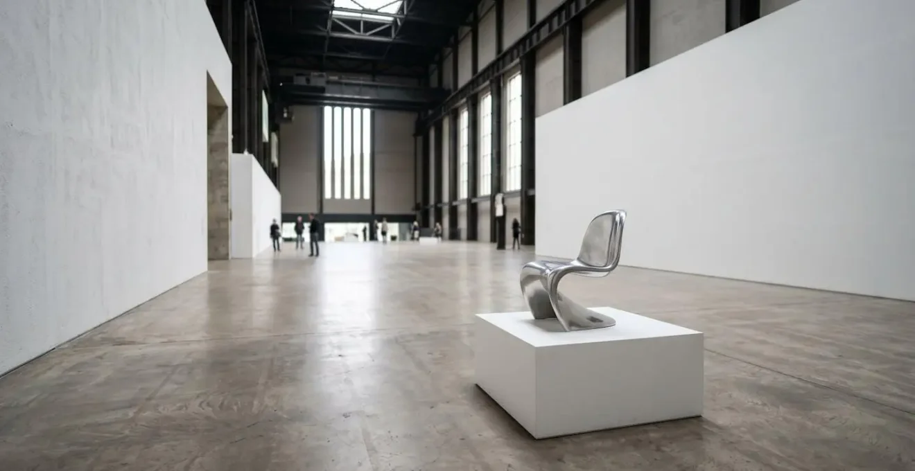
Form or Function: Can a Chair Be a Sculpture in a Fine Art Context?
The traditional dichotomy between design and art hinges on a single concept: function. A chair is for sitting; a sculpture is for contemplating. But what happens when a chair is designed to be contemplated as much as, or even more than, it is to be sat upon? This is where the lines begin to dissolve, and the context of presentation becomes paramount. An object’s classification can shift dramatically based simply on where it is placed—a showroom or a gallery’s white-walled sanctuary.
Case Study: Ron Arad’s Rover Chair Journey from Design to Fine Art
The journey of Ron Arad’s work perfectly illustrates this transformation. His groundbreaking Rover Chair (1981), famously assembled from scrapyard parts and a leather car seat, began as a piece of radical design. Yet, his creations like The Big Easy chair intentionally blur the line between furniture and sculpture. The definitive shift in context occurred when major art institutions intervened. The Museum of Modern Art’s 2009 retrospective, ‘No Discipline’, and the acquisition of his work by the V&A and Centre Georges Pompidou didn’t just celebrate his design; they institutionally re-classified it as fine art. This validation was cemented by the art market, with his pieces achieving auction prices over $400,000, a value assigned not for function, but for artistic and cultural significance.
This is the power of institutional framing. The same object that might be overlooked in a furniture store becomes a profound statement on material and form when placed on a plinth under gallery lighting. The function may still be latent, but the primary purpose has been shifted by its context from utility to aesthetic and conceptual inquiry. As Arad himself has said, design can be about imposing one’s will on materials for function, or for an artistic result. Often, in the hands of a master, it is both.
Why Does a Painting Sell for Millions while a Poster Sells for Twenty?
The vast chasm in value between a unique painting and its mass-produced poster is a stark illustration of the economic forces that define the fine art world. The price is not a measure of the image’s aesthetic appeal alone, but of a complex formula involving uniqueness, provenance, artist reputation, and market demand. A painting is a singular object, a unique trace of the artist’s hand, while a poster is one of many. This scarcity is the foundational principle of the art market’s valuation model.
This market is a powerful validating system in itself. When an auction house gavel falls, it does more than complete a transaction; it confers a specific, quantifiable level of cultural and financial importance. The United Kingdom plays a significant role in this global theatre. In a market where perception and consensus drive value, the figures are staggering; the UK art market accounted for 18% of global art sales, worth billions. This economic engine is a primary force in deciding what is and isn’t “fine art.”
Ultimately, a poster is a reproduction of an idea, whereas a painting sold at auction is treated as the idea’s definitive embodiment. The price reflects ownership of a unique cultural artifact, an asset whose value is propped up by a global system of galleries, collectors, and auction houses. The twenty-pound poster allows you to appreciate the image; the multi-million-pound painting allows you to possess its history and singularity.
Bauhaus to Now: How Did Craft Become High Art?
For centuries, a rigid hierarchy placed “fine art” (painting, sculpture) above “craft” (ceramics, textiles, metalwork). The former was seen as pure, intellectual expression, while the latter was functional, decorative, and artisanal. The Bauhaus school began to challenge this by unifying arts and crafts, but the deep-seated prejudice remained in the gallery world for decades. The elevation of craft into the realm of high art required a fundamental shift in institutional thinking and a few trailblazing artists.
No one exemplifies this shift in the UK more than Grayson Perry. As he states, “With ceramics, the purely decorative is its default position.” Historically, this default has been a barrier to entry into the fine art world. Perry shattered this barrier by using the seductive beauty of the ceramic vase as a vessel for sharp, challenging commentary on class, gender, and British society. His work is not merely decorative; it is subversive and deeply narrative.
Case Study: Grayson Perry’s Elevation of Ceramics to Turner Prize Status
The pivotal moment of institutional validation came in 2003 when Perry became the first-ever ceramicist to win the prestigious Turner Prize. This was more than a personal victory; it was a statement from the art establishment that craft could be a medium for important contemporary art. This recognition from an institution like the Tate fundamentally altered the discourse. The market quickly followed suit, as demonstrated by the £632,750 auction price for his work ‘I Want To Be An Artist’. By awarding him its highest honour, the art world officially declared that the message, not the material, was what defined a work as fine art.
Perry’s journey proves that the craft/art boundary is not a wall, but a permeable membrane. When an artist uses a “craft” medium to engage in the critical and conceptual discourse of contemporary art, and when major institutions validate that effort, the old hierarchies crumble. The material is no longer a limitation but simply another language for artistic expression.
The Mistake of Looking Down on Illustrators in the Art World
Within the creative industries, perhaps no field has been more consistently patronized by the fine art world than illustration. Often dismissed as purely commercial, subservient to a client’s brief, or simply “not serious,” illustrators have historically struggled for gallery representation. This prejudice stems from the same old dichotomies: art as personal expression versus illustration as commercial communication. Yet, contemporary practice reveals this to be a lazy and outdated assumption.
The work of an artist like David Shrigley is a case in point. His deadpan, cartoon-like drawings and handwritten texts possess a raw, immediate quality that feels worlds away from the technical polish of academic painting. It’s a style that could easily be pigeonholed as “illustration.” However, the art world has embraced him, not in spite of this style, but because of it. His work is celebrated for its wit, its poignant observations on the absurdities of modern life, and its directness.
Case Study: David Shrigley’s Crossover from Illustration to Gallery Art
Shrigley’s success demonstrates how context and critical discourse can elevate an illustrative style into the fine art canon. Rather than being confined to books or magazines, his work is exhibited in major art institutions globally. As detailed in his profile on Artnet, his drawings are now held in collections at MoMA, the Art Institute of Chicago, and the National Galleries of Scotland. This institutional embrace validates his practice as significant contemporary art. The market has also responded, with his prints forming a substantial part of his sales. This proves that a visual language rooted in illustration can, and does, function as a powerful medium for fine art, capable of supporting a critically and commercially successful career.
The mistake is to judge a work by its stylistic origins rather than its conceptual depth and intent. Shrigley, and others like him, use the accessible language of illustration to engage in the same complex conversations as any other contemporary artist. They prove that the most important factor is not the style, but the substance and the critical framework that comes to surround the work.
Gallery or Shop: Where Should You Show Work That Straddles Both Worlds?
For graphic designers and artists whose work blurs the line between art and commerce, finding the right venue for exhibition is a significant challenge. Traditional fine art galleries may be hesitant to show work with commercial roots, while retail spaces often lack the critical context to present it as art. As noted by Olly Wainwright in The Guardian, “we hear little about graphic design in the press, and see comparatively little of it represented within our public institutions.” This creates a vacuum, a need for new kinds of spaces.
In response, a new “third space” has emerged—one that is neither a pure white-cube gallery nor a simple retail store. These hybrid venues are crucial for the contextual validation of graphic art and design. They provide a legitimate platform that respects both the aesthetic quality and the conceptual rigor of the work, regardless of its origins. This is where designers can transition from commercial practitioners to exhibited artists.
Checklist: Evaluating Hybrid Exhibition Spaces
- Curation & Context: Does the space have a clear curatorial vision? Is your work placed alongside other pieces that create a meaningful dialogue, or is it treated simply as merchandise?
- Audience & Discourse: Does the venue attract an audience interested in art and design discourse? Do they host talks, publish texts, or otherwise build a critical framework around the work they show?
- Institutional Links: Does the space have connections to larger institutions (museums, universities, established galleries)? A museum shop, for example, borrows credibility from its parent institution.
- Artist Treatment: Are artists treated as collaborators or as suppliers? Look at how the work is credited, priced, and promoted. Is the focus on the creator or just the product?
- Pathways to Progression: Does showing in this space open doors to other opportunities? As the article on design galleries in ‘It’s Nice That’ argues, these spaces should be a “first step” towards wider recognition.
Perhaps the most successful examples of these hybrid spaces are the shops of major modern art museums like the Tate Modern and the V&A. Once simple souvenir stands, they have evolved into highly curated retail experiences. They function as a ‘gallery-lite,’ legitimizing designers by placing their work within the prestigious context of the museum. For many visitors, the museum shop is their first, and sometimes only, direct encounter with contemporary design. These spaces are not a compromise; they are a vital and credible new context for work that proudly straddles both worlds.
Hyperrealism or Expressionism: Which Style Better Captures Modern Anxiety?
Modern anxiety is a complex, multifaceted condition. It can be a loud, screaming panic or a quiet, pervasive hum of dread. In art, two seemingly opposite styles, Expressionism and Hyperrealism, offer compelling but starkly different methods for capturing this state. The question is, which one gets closer to the truth of the experience today? Expressionism, with its distorted forms and raw, emotive brushstrokes, externalizes the inner turmoil. It shows us what anxiety *feels* like on the inside, sacrificing objective reality for emotional truth.
Hyperrealism, on the other hand, takes the opposite approach. It renders the world with a flawless, surgical precision that goes beyond what the human eye or a standard camera can perceive. It doesn’t show us the feeling of anxiety, but rather a world so detailed, so overwhelmingly present, that it *induces* a sense of anxiety in the viewer. This is the anxiety of information overload, of the uncanny valley, of a reality that feels artificial and suffocatingly perfect. The sheer amount of detail is both mesmerizing and unsettling.
Looking at a hyperrealist eye, as in the image above, we are confronted with a level of detail that is both beautiful and disturbing. We see every fiber of the iris, every subtle reflection, a level of scrutiny that feels invasive. There is no escape into the blur of impression or emotion; we are forced to see *everything*. In a world saturated by high-resolution digital images and the pressure to present a flawless online self, the meticulous, almost inhuman surface of a hyperrealist painting can feel like a more accurate mirror to modern anxiety than the chaotic gestures of expressionism. It reflects the unease that lurks just beneath a perfectly rendered surface.
Key Takeaways
- Fine Art is Contextual: An object’s status is determined more by its presentation in a gallery or museum and the discourse around it than by its intrinsic nature or function.
- The Market is a Kingmaker: Auction prices and collector demand play a crucial role in legitimizing works and artists, effectively assigning cultural value that transcends the medium itself.
- Boundaries are Porous: The historical hierarchy separating craft, design, and illustration from fine art is actively being dismantled by major institutions and artists who use any medium for critical expression.
The Error of Calling Hyperrealism “Just Copying Photos” without Understanding the Process
One of the most common and reductive criticisms leveled at hyperrealist artists is that they are “just copying photos.” This statement fundamentally misunderstands the artistic process, equating technical skill with a lack of creativity. It presumes that the goal of art is to invent something from nothing, rather than to interpret, transform, and intensify our perception of reality. The hyperrealist’s goal is not to replicate a photograph; it is to use the photograph as a starting point for creating a new, intensified reality on the canvas.
The process is one of immense labor, patience, and thousands of deliberate artistic choices. The artist decides what to sharpen and what to soften, how to manipulate color for emotional effect, and how to translate the flat, uniform information of a digital photo into the tactile, layered surface of a painting. It is a meditative act of translation, not a mechanical act of transcription. In a world where the volume of art transactions is increasing, it becomes even more crucial for buyers to understand the value of this intensive process.
Contrast this with an artist like David Shrigley, who aims for something entirely different. He famously said of his own work, “It’s not the kind of drawing where you’re trying to get their eyes in the right place, you’re just trying to tell somebody something as directly as possible.” Shrigley seeks to bypass technique for direct communication. The hyperrealist, conversely, uses an overwhelming amount of technique to achieve a different kind of communication—one that forces the viewer to question the nature of reality, image, and the act of seeing itself. To call this “copying” is to ignore the profound conceptual and interpretive labor involved.
How to Distinguish Hand-Painted Hyperrealism from High-Res Photography?
In an age of ultra-high-resolution screens and perfectly edited digital images, the ability to distinguish a hand-painted hyperrealist work from a photograph has become a common challenge. This question is especially relevant today, as recent collector surveys indicate that 44% of buyers were new to the art market in 2024, many of whom are navigating these distinctions for the first time. The answer lies not in a quick glance, but in a deeper, more patient way of looking, focusing on the subtle “tells” of the artist’s hand.
The first clue is often the treatment of focus and depth. A camera has a single, mechanical plane of focus. A hyperrealist painter, however, can create an impossible, democratic focus where every object, near and far, is rendered with equal sharpness. Conversely, they can use soft and sharp edges in a way that feels emotive and subjective, rather than optically precise. Look for a depth of field that feels psychologically driven rather than mechanically captured.
The second area to scrutinize is the surface and texture. A photograph is a flat, smooth surface. A painting, no matter how flawlessly executed, is a physical object with layers of paint. When viewed up close or from an oblique angle, you may discern the subtle texture of the canvas or the almost imperceptible ridges of brushstrokes. This physical presence, the “aura” of the original object, is something a digital print can never truly replicate. Finally, look for interpretive choices. Are the colors slightly more saturated than in reality? Are reflections simplified or dramatized? These are not errors; they are the deliberate decisions of the artist, the fingerprints of their translation of reality into art. Distinguishing the two is a skill, a form of visual literacy that rewards close, patient observation.
Ultimately, the lines are not just blurring; they are being actively and excitingly redrawn. The next time you visit a gallery or even a museum shop, challenge your own definitions. Ask not “Is this art?” but “What systems are at play to make me see it as art?” That is where the truly fascinating conversation begins.