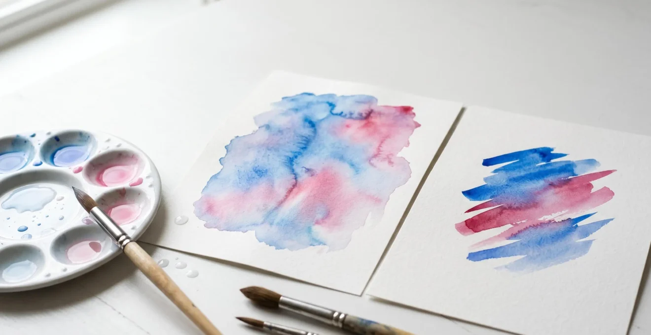
Contrary to popular belief, mastering watercolor isn’t about choosing between wet-on-wet or wet-on-dry—it’s about understanding the spectrum of dampness in between.
- « Mistakes » like blooms are controllable effects that happen in the « critical window » when paper is damp, not soaking wet.
- Your paper isn’t just a surface; it’s an active partner. Its material (cotton vs. cellulose) and texture (hot vs. cold press) dictate how much control you have.
Recommendation: Instead of practicing techniques in isolation, focus on observing how your paper dries and how pigments behave at each stage. This is the true path to control.
If you’re beginning your watercolor journey, you’ve likely been told that everything boils down to two core techniques: wet-on-wet and wet-on-dry. One is for soft, dreamy washes, and the other is for sharp, controlled details. While this is true, it’s also the source of endless confusion and frustration for new artists. We’ve all been there: that heart-sinking moment when an unwanted « cauliflower » bloom appears in a perfect sky, or when a second layer of paint lifts the first, creating a muddy mess. It feels like the medium is actively working against you.
The common advice is to simply « practice more, » but this misses the point. The real secret to taming watercolor isn’t found in rigidly separating these two techniques. It lies in the space between them. What if the key wasn’t about choosing wet paper or dry paper, but about mastering every single stage of dampness in between? This is where you unlock the ability to not just avoid accidents, but to create intentional effects with confidence.
This guide will walk you through this deeper understanding. We will explore how to read your paper’s moisture level, why your choice of paper is so critical, how different pigments behave, and how to turn potential errors into expressive strengths. By the end, you won’t see watercolor as a battle for control, but as a collaborative dance with water itself.
To help you navigate this journey, we’ve structured this guide to build your understanding from the ground up, from managing a single wash to embracing the elements outdoors. Let’s dive in.
Contents: Mastering the Nuances of Watercolor Control
- Happy Accidents: How to Create (or Avoid) Cauliflowers in Your Wash?
- Masking Fluid vs. Negative Painting: How to Keep Highlights Bright?
- Cotton vs. Cellulose: Why Does Paper Quality Matter More in Watercolor?
- The Mistake of Using Tube Green instead of Mixing Your Own
- Lift and Scrub: Can You Really Correct an Error in Watercolor?
- How to Protect Your Plein Air Painting Gear from Scottish Rain?
- Matte or Gloss: How Paper Texture Affects the Mood of Your Print?
- Why Are the Scottish Highlands Becoming the New Haven for Landscape Artists?
Happy Accidents: How to Create (or Avoid) Cauliflowers in Your Wash?
The dreaded « cauliflower » or « bloom » is often a beginner’s first frustrating encounter with watercolor’s unruly nature. It happens when you introduce a wetter brush into a wash that has already started to dry. The excess water pushes the drying pigment away, creating those feathery, light-centered shapes. But here’s the secret: this isn’t a mistake. It’s a physical process you can control and even use to your advantage. The key is to understand the critical window of dampness.
Think of your paper’s drying process in stages. When it’s glistening wet, you can work freely in a wet-on-wet fashion. When it’s completely dry, you can layer with crisp edges. The magic—and the danger—is in the middle, during the « satin sheen » stage. This is when the paper has lost its glossy shine but is still cool and damp to the touch. This is the moment a drop of water will create a bloom. By learning to see this stage, you gain control.
This illustration gives a close-up view of how water and pigment interact on the paper fibers. Notice how the water displaces the pigment particles, creating a concentrated edge. This is the very physics behind a bloom.
Instead of fearing this effect, you can harness it. Many professional artists use this technique deliberately to create beautiful, organic textures. It’s a perfect way to suggest soft clouds, distant foliage, or the dappled light on a forest floor. It’s not about avoiding accidents; it’s about making them intentional.
Case Study: The Intentional Bloom Technique for Cloud Textures
Watercolor artist Louise De Masi demonstrates how to deliberately create blooms by applying paint during the ‘satin sheen’ stage—when the paper transitions to just moist. By introducing clean water with a round brush at this critical moment, the water gently pushes colored pigments aside, creating organic, feathery patterns perfect for suggesting soft cloud edges, distant foliage, or dappled light on water. The technique transforms what beginners fear as mistakes into controlled expressive elements.
Masking Fluid vs. Negative Painting: How to Keep Highlights Bright?
One of the first rules of watercolor is that you can’t really add white back in; you must preserve the white of the paper. This means you have to plan your highlights from the very beginning. For a beginner, this can feel like a high-stakes decision. Fortunately, you have several wonderful tools and techniques at your disposal, each creating a different effect. The two most powerful methods are using masking fluid and painting negatively.
Masking fluid is a liquid latex that you paint onto the areas you want to keep white. Once it’s dry, you can paint your washes right over it. After your paint is dry, you gently rub the masking fluid off, revealing the crisp, bright white paper underneath. It’s a fantastic, almost magical tool for protecting sharp details like the glint in an eye, thin branches against a sky, or reflections on water. It is a very direct and tool-based approach, which can be comforting for beginners.
Negative painting, on the other hand, is a more thought-provoking process. Instead of painting the object itself, you paint the space *around* it. To make a white flower petal stand out, you carefully paint the background colors right up to its edge. This technique creates softer, more organic edges and is wonderful for defining shapes within complex areas like a cluster of leaves or creating atmospheric effects like fog. It requires more brush control and planning, but it’s an incredible skill for developing your compositional eye.
Neither technique is « better »—they are simply different tools for different jobs. Understanding when to use each one will dramatically expand your artistic vocabulary. This table compares the two, along with a couple of other useful methods for preserving or recovering highlights.
| Technique | Edge Type | Best For | Skill Level | Time Investment | Paper Requirement |
|---|---|---|---|---|---|
| Masking Fluid | Sharp, hard edges | Man-made objects, reflections, architectural details, star fields | Beginner-friendly (tool-based) | Quick application but requires drying time | High-quality cotton paper essential to prevent tearing on removal |
| Negative Painting | Soft, organic edges | Fog, fur, flower petals, atmospheric effects, gradual transitions | Intermediate (requires brush control and compositional thinking) | Slower, deliberate painting around shapes | Works on any paper quality |
| Wax Crayon Resist | Textured, broken edges | Batik-like effects, textured surfaces, sparkling highlights | Beginner-friendly | Quick but permanent | Any paper |
| Lifting with Brush | Soft, diffused recovery | Soft highlights, corrections on non-staining pigments | Intermediate | Immediate | Cotton paper preferred |
Cotton vs. Cellulose: Why Does Paper Quality Matter More in Watercolor?
When you’re starting out, it’s tempting to save money on paper. But if there is one piece of advice every watercolorist would agree on, it’s this: your paper is more important than your paint or your brushes. The reason is simple: paper isn’t just a surface; it’s an active partner in the painting process. It manages the water, which is the very soul of the medium. The difference between student-grade (cellulose) and professional-grade (100% cotton) paper is night and day.
Cellulose paper, made from wood pulp, has short fibers. Water tends to sit on the surface, causing the paper to buckle easily and dry very quickly. This drastically shortens your « critical window, » giving you less time to blend colors and making blooms almost unavoidable. Pigment doesn’t absorb as deeply, so it can be difficult to layer without lifting the colors underneath.
In contrast, 100% cotton paper has long, strong, and incredibly absorbent fibers. It can hold a great deal of water without buckling and, most importantly, it stays wet much longer. This gives you a wonderfully extended working time for wet-on-wet techniques. The paint sinks into the fibers, allowing for beautiful, luminous layers. And because the fibers are so durable, you can lift, scrub, and correct mistakes without the paper tearing or pilling. Though it’s more expensive, cotton paper is not a luxury; it’s an investment in your own success and enjoyment.
Your Action Plan: The Scrub Test to Evaluate Paper Durability
- Paint Swatches: Paint a dark swatch (use concentrated ultramarine or burnt sienna) on both a cotton and a cellulose paper sample. Let them dry completely for at least a few hours.
- Prepare for Lifting: Wet a stiff, synthetic brush thoroughly with clean water. You want it damp, not dripping.
- Scrub the Cotton: Gently scrub the dried swatch on the cotton paper in small, circular motions for about 30 seconds. Blot with a paper towel.
- Observe the Result: Notice how the cotton paper releases the pigment cleanly without the surface pilling, tearing, or feeling damaged. The paper remains intact and ready for more paint.
- Repeat on Cellulose: Now, repeat the exact same scrubbing process on your cellulose paper swatch. You will likely see the paper surface start to disintegrate, creating a fuzzy, damaged texture. This practical test proves cotton’s superior resilience.
The Mistake of Using Tube Green instead of Mixing Your Own
As you browse the art store, you’ll see a dazzling array of pre-mixed green paints: Sap Green, Hooker’s Green, Olive Green. They look so convenient and vibrant in the tube. However, relying on these can be one of the biggest hurdles to achieving natural, harmonious landscapes. The problem isn’t that these greens are « bad, » but that they are often flat and lifeless compared to the infinite variety you can mix yourself.
Most pre-mixed greens are made from two, three, or even more different pigments. This might not sound like a problem, but it limits your control and can lead to muddy colors. As watercolor artist Jennifer Branch explains, this is a critical concept for beginners. She points out that you’re starting with a complex mix before you even begin.
Sap Green or Hooker’s Green look lovely when you first paint them, but you’re already starting with 3 different pigments in each tube. Three pigments is the maximum amount a beginning artist should use before it turns to mud.
– Jennifer Branch, How to Mix Greens Watercolor Painting Lesson
The solution is wonderfully simple: mix your own greens using just one blue and one yellow. By starting with a « warm » yellow (like Cadmium Yellow) and a « cool » blue (like Phthalo Blue), or a « cool » yellow (Lemon Yellow) and a « warm » blue (Ultramarine), you can create an incredible range of greens. A warm, sunlit green for a field in the foreground can be mixed from Ultramarine and Hansa Yellow. A cool, distant shadow green for a faraway hill can come from Prussian Blue and Lemon Yellow. This approach gives you complete control over the temperature and harmony of your painting, ensuring all your greens feel like they belong in the same world.
This illustration shows the beauty of mixed greens. Notice the subtle variations and the way the pigments granulate and separate, creating a natural texture that a tube green can rarely replicate.
Learning to mix your own greens is a game-changer. It forces you to see color like an artist, and the results are always more sophisticated and believable. The following table provides a simple system to get you started on your green-mixing journey.
| Green Type | Blue Component | Yellow Component | Temperature | Best Use | Optional Modifier |
|---|---|---|---|---|---|
| Warm Sunlit Green | Ultramarine Blue (warm) | Cadmium Yellow or Hansa Yellow (warm) | Warm | Sunlit leaves, spring foliage, foreground vegetation | Add tiny amount of Cadmium Red to neutralize for atmospheric depth |
| Cool Shadow Green | Prussian Blue or Phthalo Blue (cool) | Lemon Yellow (cool) | Cool | Shadow areas, distant trees, evergreens, receding planes | Add Quinacridone Rose for deep cool shadow greens |
| Neutral Balanced Green | Cobalt Blue (mid-temperature) | Winsor Yellow or Hansa Yellow (mid-temperature) | Neutral | Versatile mid-tone foliage, garden scenes, general landscape work | Add Raw Sienna or Burnt Sienna for earthy, grayed-down natural greens |
| Olive/Earthy Green | Ultramarine Blue (warm) | Raw Sienna or Yellow Ochre | Warm/Muted | Dried grass, autumn foliage, underpainting for complex vegetation | Perfect as-is for naturalistic landscapes |
Lift and Scrub: Can You Really Correct an Error in Watercolor?
Watercolor has a reputation for being unforgiving. Once a mark is made, it’s there forever, right? Well, not exactly. While it’s true that watercolor is transparent and planning is key, you have far more options for correction than you might think. The ability to « lift » or remove paint depends on two critical factors: your paper (as we’ve seen, cotton is king) and the pigment behavior of your paints.
Not all pigments are created equal. They fall into two main categories: staining and granulating. * Staining pigments are made of very fine particles that dye the paper’s fibers. Colors like Phthalo Blue and Quinacridone Rose penetrate deeply and are nearly impossible to remove completely. They are beautiful and vibrant, but you must use them with care in areas you might want to adjust later. * Granulating pigments are made of heavier, more irregular particles. They tend to settle into the texture (the « valleys ») of your paper rather than staining the fibers. Colors like Ultramarine Blue and most earth tones (like Burnt Sienna) sit more on the surface and can be lifted off quite effectively, even when dry.
Understanding which of your paints are staining and which are granulating is incredibly empowering. It allows you to plan your painting strategically, using granulating colors in areas where you might want to create soft highlights or correct an edge, and saving staining colors for bold, permanent statements. You can find this information on the paint tube or the manufacturer’s website.
When an area is still wet, you can use a « thirsty brush »—a clean, damp brush—to lift out color like a small sponge. When paint is dry, you can re-wet an area and gently scrub with a stiff synthetic brush to loosen the pigment before blotting it away. This technique is remarkably effective with granulating pigments on good cotton paper. So, yes, you absolutely can correct errors. The key is knowing your materials.
This chart gives a clear breakdown of how different pigment types behave and your options for correcting them, based on an analysis of pigment properties.
| Pigment Type | Behavior | Liftability | Examples | Correction Strategy |
|---|---|---|---|---|
| Staining Pigments | Fine particles that dye the paper fibers, penetrate deeply | Very difficult to lift—nearly permanent | Phthalo Blue, Phthalo Green, Quinacridone colors, Prussian Blue | Avoid using in areas likely to need correction. Use diluted. Plan carefully before application. |
| Granulating Pigments | Heavier particles that settle into paper texture, sit on surface | Easy to lift—can be scrubbed and removed effectively | Ultramarine Blue, French Ultramarine, Cobalt colors, Earth tones (Raw Sienna, Burnt Sienna) | Ideal for areas requiring flexibility. Can be lifted with wet stiff brush, sponge, or even aggressive scrubbing on cotton paper. |
| Semi-Staining Pigments | Moderate particle size with partial penetration | Moderate—some pigment lifts, some stains | Cadmium colors, some synthetic earth tones | Partial correction possible with gentle lifting. Multiple gentle lifts better than one aggressive scrub. |
How to Protect Your Plein Air Painting Gear from Scottish Rain?
Painting outdoors— »en plein air »—is one of the most rewarding experiences for a landscape artist. It forces you to work quickly and capture the essence of a scene. But what happens when the environment isn’t cooperating? Painting in a light drizzle or the persistent « dreich » of the Scottish Highlands might seem impossible, but with the right gear and mindset, it can lead to wonderfully atmospheric results.
The primary challenge is, of course, keeping your paper from getting soaked by unwanted raindrops. A large golf umbrella is a good start, but holding it while you paint is impractical. The solution is a hands-free umbrella system. Many artists use a clamp designed for photography equipment, like the Manfrotto spring clamp, to attach an umbrella directly to their easel or tripod. This creates a small, personal shelter for your work surface, allowing you to continue painting while protecting your wash from the rain.
However, an even more innovative approach is to change not your setup, but your surface. This is where understanding your materials becomes a superpower. Some artists are embracing the rain by switching to fully waterproof synthetic papers, which opens up entirely new possibilities for painting in wet conditions.
Case Study: Waterproof Synthetic Papers for Rainy Plein Air Conditions
For challenging wet weather conditions like Scottish rain, watercolor artists have successfully adopted synthetic and mineral-based papers such as Yupo and Legion Mineral Paper. Unlike traditional cotton or cellulose papers, these surfaces are completely waterproof and non-absorbent. Water and pigment sit on the surface, creating unique fluid effects while the paper remains flat without buckling. If rain drops hit the painting, they can simply be wiped away without damage. The non-porous surface allows extended working time for wet-on-wet techniques and the paper can be reactivated even after drying, making it ideal for the unpredictable dreich of the Highlands.
Ultimately, painting in the rain is an exercise in letting go of absolute control and collaborating with the elements. You can shield yourself from the weather, or you can choose materials that allow you to incorporate it into your art. Either way, it’s a testament to how preparation and material knowledge can turn a challenge into an opportunity.
Matte or Gloss: How Paper Texture Affects the Mood of Your Print?
We’ve established that the material of your paper (cotton) is crucial for water control. The final piece of the paper puzzle is its surface texture. This texture, also known as its « tooth, » has a profound impact on how the paint behaves and the final mood of your artwork. The three main surfaces are Hot Press, Cold Press, and Rough.
Hot Press paper is the smoothest. It’s passed through hot metal rollers during production, which flattens the fibers into a sleek, almost glossy surface. Because there is very little texture, paint flows smoothly and it’s ideal for fine detail, sharp lines, and uniform washes. Botanical illustrators and portrait artists often favor it. Pigments don’t granulate much on hot press, as there are no « valleys » for them to settle into.
Cold Press is the most popular and versatile surface. It has a noticeable texture or « matte-like » finish. This moderate tooth is fantastic for both washes and detail work. It also brings out the beauty of granulating pigments, creating lovely, subtle textures in your washes. If you’re unsure where to start, cold press is always a great choice for any subject.
Rough paper, as the name implies, has a very pronounced, heavy texture. This aggressive tooth is not ideal for fine detail, but it is spectacular for bold, expressive washes. The pigment pools dramatically in the deep valleys of the paper, creating strong granulation and textural effects that become a major feature of the artwork. It’s a favorite for dramatic landscapes and seascapes.
Your choice of paper surface is an artistic one. Do you want the smooth precision of hot press, the versatile balance of cold press, or the dramatic texture of rough? As this guide to paper qualities shows, aligning your paper’s texture with your subject and style is a powerful way to enhance the mood of your work.
| Paper Surface | Texture Description | Light Reflection | Granulation Effect | Best Techniques | Ideal Subjects |
|---|---|---|---|---|---|
| Hot Press (Smooth/Gloss-like) | Smooth, almost slick surface with minimal tooth | High reflectivity, colors appear more saturated | Minimal—pigments don’t settle into texture | Wet-on-dry detail work, fine lines, controlled washes, pen and ink combinations | Botanical illustration, architectural detail, portraits, scientific illustration |
| Cold Press (Matte-like, Medium Texture) | Moderate tooth with visible texture, most versatile | Moderate reflection, balanced color appearance | Moderate—creates attractive subtle texture in washes | Versatile for all techniques, excellent wet-on-wet blending, good for layering | Landscapes, general subjects, expressive styles, most popular choice |
| Rough (Heavily Textured) | Pronounced peaks and valleys, aggressive tooth | Low reflectivity, light scatters in multiple directions, colors appear less saturated but more textured | Dramatic—pigment pools heavily in valleys, creates strong granulation | Bold wet-on-wet effects, dramatic washes, texture becomes integral to art | Loose expressive landscapes, seascapes, abstract work, dramatic atmospheric pieces |
Key Takeaways
- True watercolor control comes from understanding the drying stages of paper, not just from choosing between wet-on-wet and wet-on-dry.
- Your materials are active partners: 100% cotton paper gives you more time and forgiveness, while pigment properties (staining vs. granulating) dictate your ability to make corrections.
- Embrace a mindset of collaboration with the medium. « Mistakes » like blooms and the challenges of weather can be turned into intentional, expressive features of your art.
Why Are the Scottish Highlands Becoming the New Haven for Landscape Artists?
When you bring together all the concepts we’ve discussed—water control, paper, pigment behavior, and embracing the environment—you begin to see watercolor not as a technique to be learned, but as a holistic practice. There is perhaps no better place to witness this in action than the Scottish Highlands, a region that is increasingly becoming a destination for serious landscape artists.
At first, this might seem counterintuitive. Why would artists flock to a place known for its challenging, damp, and unpredictable weather? The answer lies in everything we’ve explored. The high ambient humidity of the Highlands naturally extends the drying time of watercolor paper. This creates a longer, more forgiving critical window of dampness, making it an ideal natural laboratory for practicing wet-on-wet techniques and achieving soft, atmospheric effects that are difficult to produce in drier climates.
This pilgrimage is not new. Contemporary artists are following a rich historical tradition, channeling the spirit of late 19th and early 20th-century masters who were drawn to Scotland’s unique light.
Case Study: The Glasgow Boys and Scottish Colourists’ Artistic Pilgrimage
The Scottish Highlands’ emergence as a contemporary watercolor destination connects to a rich artistic legacy. As detailed by institutions like the National Galleries of Scotland, The Glasgow Boys (late 19th century) and the Scottish Colourists (early 20th century) were masters of capturing Scotland’s unique atmospheric light and dramatic weather conditions. These artists pioneered techniques for rendering the ‘liquid light’ effect—the interplay of mist, rain, and fleeting sunshine that characterizes Scottish landscapes. Contemporary watercolorists are following this historical tradition, treating the Highlands as both artistic pilgrimage and natural laboratory. The region’s high ambient humidity naturally extends paper drying time, creating ideal conditions for extended wet-on-wet work impossible in drier climates, while the dramatic weather provides constantly changing reference material that challenges and develops mastery of atmospheric techniques.
The artists who travel to places like the Highlands are not fighting the water; they are collaborating with it. They understand their materials so well that they can work in harmony with the environment, using the mist and humidity as an active tool in their art. It is the ultimate expression of moving beyond the simple binary of « wet-on-wet » vs. « wet-on-dry. » It is about speaking the language of water.
Your journey in watercolor is just beginning. The most important step you can take now is to pick up your brush, put these ideas into practice, and start your own conversation with water. Happy painting.