The shift from tempera to oil wasn’t about one medium being ‘better’, but a story of evolving artistic goals demanding new technical solutions.
- Byzantine artists used tempera’s properties to achieve spiritual luminosity, not earthly realism.
- Renaissance masters pushed its linear limits to model form, while later innovators created hybrids like “tempera grassa” to bridge the gap with oil painting.
- Modern artists revived tempera not for its historical significance, but for its unique graphic qualities and matte finish, proving its enduring relevance.
Recommendation: To truly appreciate a masterpiece, look beyond the image and understand the technical conversation between the artist’s ambition and the very materials they held in their hands.
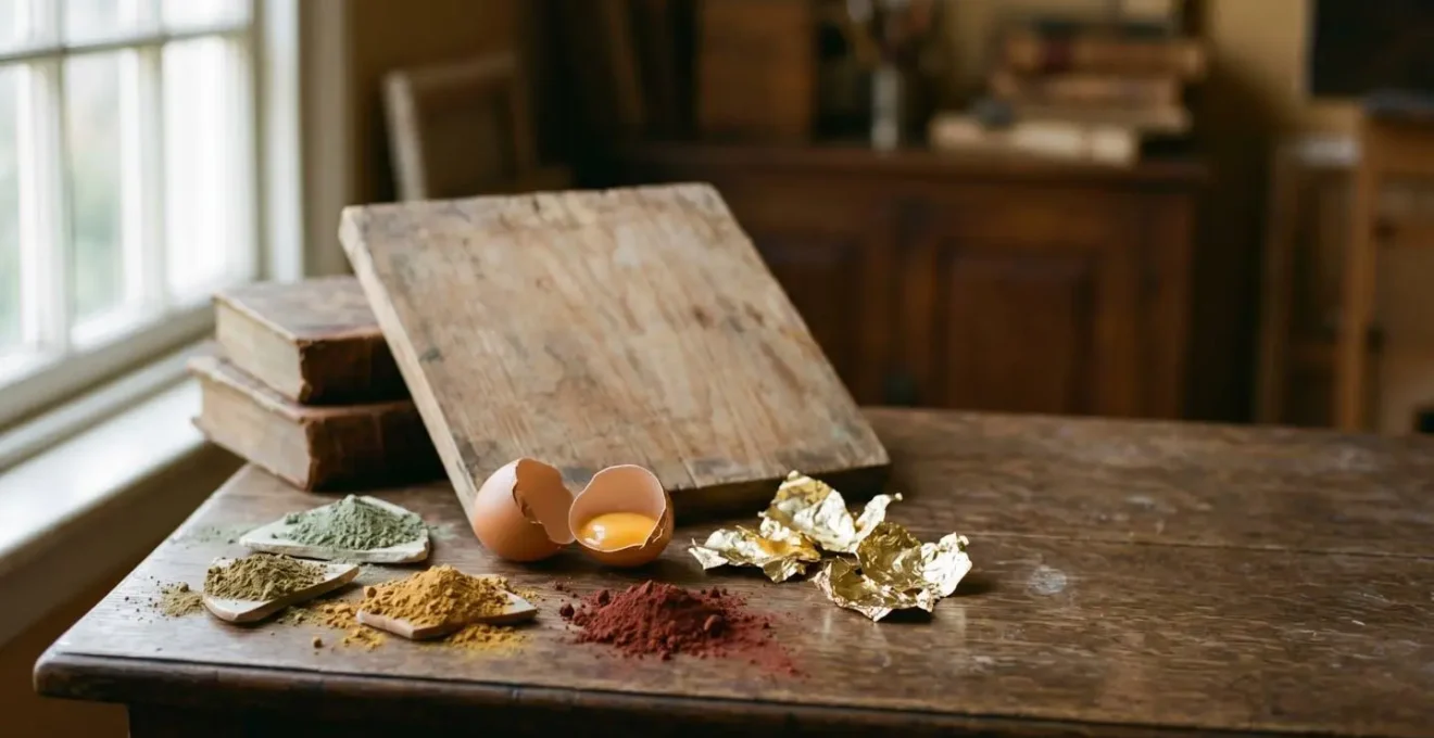
At first glance, the shimmering, otherworldly gold of a Byzantine icon and the soft, fleshy tones of a Florentine Madonna seem worlds apart. Yet, they are often born from the same fundamental substance: tempera, a paint bound together with egg yolk. The common understanding of tempera often stops at this simple definition, noting its fast-drying nature as a primary characteristic. This view, however, misses the rich and complex narrative of its evolution. The history of tempera is not a simple timeline culminating in its “replacement” by the supposedly superior medium of oil paint.
Instead, it is a fascinating story of a continuous material dialogue. It is a tale of how artists, driven by shifting cultural and aesthetic ambitions, pushed, adapted, and eventually synthesized this demanding medium. The key to understanding this evolution is to move beyond seeing tempera as a static recipe and instead view it as a partner in creation, one whose constraints and possibilities shaped the very course of Western art. From the spiritual goals of Byzantine iconographers to the humanist drive for realism in the Renaissance, the technique was in constant conversation with the artist’s intent.
This article will trace that technical dialogue. We will explore the optical logic behind Byzantine underpainting, see how Florentine masters stretched the medium to its linear limits, analyze the gradual synthesis with oil, and witness tempera’s surprising revival in the modern era. By examining the ‘why’ behind each technical shift, we can appreciate the material genius that underpins the history of painting.
To navigate this technical and historical journey, the following sections will deconstruct the key stages of tempera’s evolution, from its spiritual apex to its modern reinterpretation.
Summary: The Technical and Artistic Evolution of Tempera Painting
- Gold and Green Underpainting: Why Did Icons Look That Way?
- Lines and Volume: How Did the Florentines Push Tempera to its Limits?
- Why Did Van Eyck and Others Abandon Tempera for Oil?
- Wyeth and Shahn: Who Brought Tempera Back in Modern America?
- The Error of Confusing Tempera with Distemper in Museum Labels
- The Ambassadors: Why Is There a Distorted Skull at the Bottom?
- From Van Dyck to YBA: How Has the “Selfie” Evolved in British Art History?
- What Hidden Symbols in Famous British Paintings Have You Missed?
Gold and Green Underpainting: Why Did Icons Look That Way?
The visual language of Byzantine icons was not concerned with earthly realism, but with creating a window into a divine, metaphysical realm. The materials and techniques were meticulously chosen to serve this spiritual purpose. Gold leaf was not merely decorative; it was a medium of light itself. As one academic study on iconography notes, gold backgrounds were meant to interact with the ambient light of a candle-lit church, creating a shimmering, dematerialized space that defied physical depth. This transformed the painting from a static object into a dynamic, luminous presence.
This optical logic extended to the rendering of flesh. The ethereal, pale skin tones of saints and holy figures were achieved through a sophisticated layering process starting with a green underpainting, a technique known as verdaccio. This wasn’t an arbitrary choice; the cool green, showing through thin, translucent layers of pink and white, optically neutralizes the warm flesh tones, preventing them from appearing too ruddy or lifelike. The goal was to suggest sanctified flesh, not mortal skin. The entire process was a highly controlled execution of material science, as evidenced by scientific analysis of a post-Byzantine icon from Kastoria, which revealed complex ground layers of gypsum and beeswax alongside the use of sophisticated pigments.
This cross-section view demonstrates the layered structure. The verdaccio layer is not a mistake or a base coat in the modern sense; it is a crucial, active optical component in achieving the final, otherworldly effect demanded by Byzantine technical ambition. The resulting image was meant to be contemplated, not simply observed.
Lines and Volume: How Did the Florentines Push Tempera to its Limits?
As the Renaissance dawned in Florence, artistic ambition shifted dramatically. The focus moved from the divine realm to the human one, demanding naturalism, emotional depth, and a convincing illusion of three-dimensional space. This presented a significant challenge for artists working in egg tempera. The medium dries almost instantly, making the smooth, subtle blending of tones (sfumato) that defines later oil painting nearly impossible. Florentine masters, therefore, had to find a different solution to model volume, a solution dictated by the very constraints of their medium.
They found it in the line. As described by sources like Cennino Cennini’s 15th-century treatise Il Libro dell’Arte, they developed a highly disciplined system of cross-hatching. Volume was not built up through blended tones, but through the patient, meticulous application of thousands of tiny, precise brushstrokes. According to a detailed analysis of Cennini’s codified Florentine process, flesh tones were constructed in strict sequential steps over a green earth underpainting, building form through progressively lighter networks of lines. As the Encyclopaedia Britannica explains:
Effects of shaded modelling therefore had to be obtained by a crosshatching technique of fine brush strokes.
– Encyclopaedia Britannica, Tempera painting | History, Techniques & Examples
This technique turned tempera’s greatest weakness—its rapid drying time—into a strength. It forced a graphic clarity and precision that became a hallmark of the Quattrocento style. Artists like Botticelli and Fra Angelico did not fight the medium; they engaged in a material dialogue, pushing its linear qualities to their absolute limit to meet the new demand for realistic form.
Why Did Van Eyck and Others Abandon Tempera for Oil?
The term “abandon” is misleading; the transition from tempera to oil in the 15th century was less of a sudden revolution and more of a gradual synthesis driven by new artistic needs. While Florentine masters perfected the art of linear modeling, Northern European artists like Jan van Eyck sought a different kind of realism—one based on light, texture, and atmospheric depth. Tempera’s opacity and fast-drying nature were limitations in this pursuit. Oil paint offered two transformative advantages: luminosity and time.
Unlike tempera, which dries rapidly, oil paint remains workable for significantly longer, allowing for wet-in-wet blending, soft transitions, and meticulous corrections. Pigments suspended in oil also trap and refract light differently, creating a jewel-like depth and brilliance that was impossible with the matte surface of egg tempera. The result was a new visual language capable of rendering the glint of metal, the softness of velvet, and the subtle haze of a distant landscape with breathtaking fidelity. This was not simply a better technique, but the right technique for a new technical ambition.
Case Study: The Hybrid Technique of Giovanni Bellini
The Venetian painter Giovanni Bellini’s career perfectly documents this evolution. Rather than abruptly switching mediums, he experimented with a hybrid known as tempera grassa, where oil was added directly to the egg emulsion. This technique, detailed in analyses of his work, allowed him to retain the crisp drawing of tempera while introducing the smoother blending and transparency of oil. This gradual synthesis demonstrates that the move to oil was a sophisticated technical exploration, not a simple rejection of the past.
The shift was ultimately about choosing the right tool for the job. For artists seeking to capture the infinite subtleties of the visible world, oil provided a far more flexible and luminous vocabulary.
Wyeth and Shahn: Who Brought Tempera Back in Modern America?
After centuries of being overshadowed by oil, egg tempera experienced a significant and surprising revival in 20th-century America. This was not an act of antiquarian nostalgia, but a deliberate choice by modern artists who found in the “obsolete” medium a unique voice perfectly suited to contemporary sensibilities. Artists like Andrew Wyeth, Paul Cadmus, and Ben Shahn were drawn to tempera’s distinctive qualities: its matte surface, its graphic precision, and its capacity for meticulous detail.
The revival was fueled by institutional support. As documented in studies of the period, the Works Progress Administration’s (WPA) mural projects in the 1930s promoted durable, traditional media, leading artists like Ben Shahn to champion tempera for its stark, linear quality in public works. Simultaneously, Yale University became a hub for the movement after Daniel V. Thompson published his influential translation of Cennini’s treatise. The scale of this movement was significant; a major exhibition on the topic documented more than 50 works by major American artists who had embraced the medium.
For an artist like Andrew Wyeth, tempera was essential to his vision. The dry, austere aesthetic of rural Pennsylvania was perfectly captured by the medium’s dry-brush technique and restrained palette. The meticulous cross-hatching, once used by Florentines to model form, was repurposed by Wyeth to render the weathered texture of wood, the delicate blades of winter grass, and the stark emotional landscape of his subjects. He didn’t use tempera to imitate the past; he used its inherent properties to create a thoroughly modern, and deeply American, form of realism.
The Error of Confusing Tempera with Distemper in Museum Labels
While art historians debate stylistic evolution, a critical distinction with profound practical consequences lies at the microscopic level: the difference between tempera and distemper. Though they can appear similar to the naked eye, their chemical compositions are fundamentally different, and confusing them can be catastrophic. True egg tempera uses an egg yolk emulsion as its binder, which cross-links and polymerizes as it cures, becoming highly durable and water-resistant. Distemper, on the other hand, uses a simple animal glue (size) as its binder, which remains water-soluble indefinitely.
The distinction is a crucial conservation imperative. As conservation scientists warn, treating a water-soluble distemper painting with the aqueous cleaning methods appropriate for water-resistant egg tempera would irrevocably damage or even destroy the artwork. This makes accurate binder identification essential before any restoration work is undertaken.
A misidentified painting could be destroyed during restoration, as the treatment for water-resistant egg tempera is vastly different from that for water-soluble animal glue-based distemper.
– Conservation science analysis, Material characterization studies of Byzantine icons
Fortunately, modern conservation labs are equipped to make this distinction with certainty. Techniques such as gas chromatography-mass spectrometry (GC-MS) and Raman microscopy allow scientists to analyze minute samples of a painting’s binder and identify its precise chemical makeup. As demonstrated in a study of post-Byzantine icon pigments, these methods can confirm the presence of proteinaceous materials (egg) versus animal glue. This scientific approach corrects historical misattributions on museum labels and ensures that these irreplaceable cultural artifacts are preserved with the appropriate care, honoring the specific material choices made by the artist centuries ago.
The Ambassadors: Why Is There a Distorted Skull at the Bottom?
Hans Holbein the Younger’s masterpiece, “The Ambassadors” (1533), is famed for the anamorphic skull that stretches ominously across its foreground—a memento mori that snaps into focus only when viewed from a sharp angle. While the skull’s symbolism is a subject of endless fascination, the technical achievement it represents is a testament to the new possibilities offered by evolving paint technology. Holbein, a master who stood at the crossroads of Northern and Southern European traditions, was proficient in both tempera and, more critically for this work, the increasingly dominant oil medium.
The creation of such a precise optical illusion required a level of control that oil paint was uniquely suited to provide. The slow drying time allowed Holbein to meticulously plot the distorted projection and blend the colors and tones with a seamless finish. The rich, layered glazes possible with oil gave the surrounding objects—the detailed textiles, gleaming scientific instruments, and deep shadows—their astonishing realism. Attempting such a large-scale, smoothly blended anamorphic effect with the rapid-drying, linear nature of pure egg tempera would have been a near-impossible task. The skull is therefore not just a symbolic marvel; it is a demonstration of technical virtuosity, showcasing an artist’s complete mastery over a medium that could translate complex geometric concepts into a flawless painted surface.
From Van Dyck to YBA: How Has the “Selfie” Evolved in British Art History?
The self-portrait, or the historical “selfie,” provides a fascinating lens through which to view the evolution of art, an evolution inextricably linked to the materials used to create it. The way artists represent themselves is profoundly shaped by the technical possibilities and constraints of their chosen medium. In British art history, this trajectory runs from the masterful oils of Anthony van Dyck to the provocative mixed-media works of the Young British Artists (YBAs).
A 17th-century self-portrait by Van Dyck, for instance, is a study in the power of oil paint. The deep, luminous colors, the subtle modeling of flesh, the masterful rendering of lace and silk—all are hallmarks of a medium that allows for layering, glazing, and a prolonged working time. The resulting image conveys not just a likeness, but also a sense of status, atmosphere, and inner life. Contrast this with an imagined Renaissance self-portrait in tempera. It would likely possess a more graphic, linear quality. The form would be defined by precise lines and hatching rather than soft, blended tones, conveying a different kind of presence—perhaps more direct and sharply defined, but less atmospheric. The material dialogue is completely different. The YBAs of the late 20th century shattered this tradition entirely, often abandoning paint for photography, sculpture, or conceptual installations, where the idea of the “self” is deconstructed rather than depicted. The evolution of the self-portrait is thus a story told not just in faces, but in paint, plaster, and pixels.
Key Takeaways
- Byzantine tempera was a spiritual tool; techniques like gold leaf and green underpainting were used to create metaphysical light, not earthly realism.
- Renaissance masters met the demand for naturalism by pushing tempera’s linear qualities to their limits, using cross-hatching to model three-dimensional form.
- The transition to oil was a gradual synthesis, with artists creating hybrids like “tempera grassa” to gain oil’s benefits in blending and luminosity while retaining tempera’s precision.
What Hidden Symbols in Famous British Paintings Have You Missed?
The practice of embedding hidden symbols and complex iconography within a painting—a tradition that reached its zenith in the Northern Renaissance but continued for centuries—relies heavily on the technical capabilities of the artist’s medium. For a symbol to be effective, whether as a moral warning or a display of intellect, it must be rendered with sufficient clarity and detail. The choice of paint was therefore not incidental to the act of symbolic communication; it was instrumental.
The meticulous, jewel-like quality of early oil paintings, for example, was perfectly suited for this task. Artists like Holbein or his predecessors could use fine brushes and the slow-drying nature of oil to render minute details: a snuffed-out candle, a crack in a lute string, or a specific species of flower, each carrying a specific symbolic weight. The ability to layer translucent glazes of oil paint also allowed for the creation of incredible depth and realism on a small scale, making these symbolic objects appear as tangible parts of the scene. While the precise lines of tempera could also create clear details, the rich textures and deep, luminous shadows of oil painting gave these symbols an unparalleled physical presence and visual intrigue.
Therefore, when we seek out hidden symbols in art, we are also bearing witness to a painter’s technical skill. The meaning is conveyed not just by what is depicted, but by how masterfully the medium has been manipulated to make that depiction both convincing and clear, inviting the viewer into a deeper, more complex visual conversation.
To truly understand a work of art, one must look past the surface image and engage with the material from which it is made. The evolution of tempera demonstrates that technique is not merely a servant to an idea, but an active participant in its creation. Appreciating this ongoing dialogue between artistic ambition and material possibility is the next step in deepening your understanding of art history.
Frequently Asked Questions About Byzantine vs Renaissance: How Did Tempera Techniques Evolve in History?
What is the main difference between Byzantine and Renaissance tempera technique?
The primary difference lies in the artistic goal. Byzantine technique used tempera to create flat, luminous, and spiritual figures with gold backgrounds and green underpainting (verdaccio) for an otherworldly effect. Renaissance technique adapted tempera to achieve naturalism and three-dimensional volume, primarily through the use of linear cross-hatching to model form, as the fast-drying medium did not allow for smooth blending.
Why is tempera paint not as common today?
Oil paint, and later acrylics, offered more flexibility and a different range of effects. Oil paint dries much slower, allowing artists to blend colors smoothly (a technique known as sfumato) and make changes over several days. Its ability to be applied in thin, transparent glazes creates a depth and luminosity that is difficult to achieve with the more opaque and matte finish of egg tempera. While tempera was revived by modern artists for its unique graphic qualities, oil and acrylics became the dominant media for most painters.
Is tempera painting difficult?
Yes, tempera painting is considered a challenging medium that demands discipline and precision. Because it dries almost instantly, colors cannot be easily blended on the painting surface. The artist must pre-mix all tonal values and apply them using methodical, fine brushstrokes like cross-hatching to build up form. The process is less forgiving than oil painting and requires significant planning before the brush ever touches the panel.